
City Map Illustrations for Travel Features

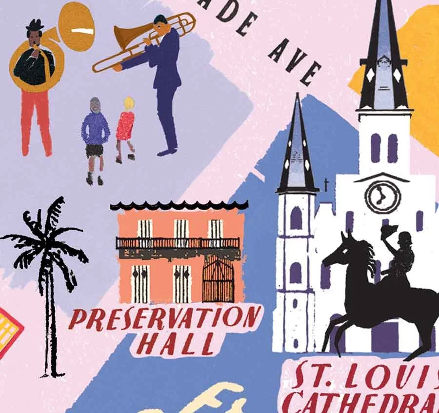
Illustrated map of New Orleans capturing iconic landmarks alongside trendy neighbourhoods, infused with musicality, Mardi Gras and French influences
As a long term contributor, I had the opportunity to create a series of National Geographic Traveller magazine city map illustrations.
Illustrated with local character
One of the goals of the series was to reflect cultural identity as well as architecture - New Orleans’ unassuming but iconic Preservation Hall is tucked into the backstreets, with jazz musicians adding rhythm and life to the surrounding detail
Painting a Picture of Adventure
This series took the reader on a journey, exploring some of the world's most iconic cities, guided by the insights of a local writer. Each map served as a visual companion to the text, and worked in collaboration with the writer's unique voice.
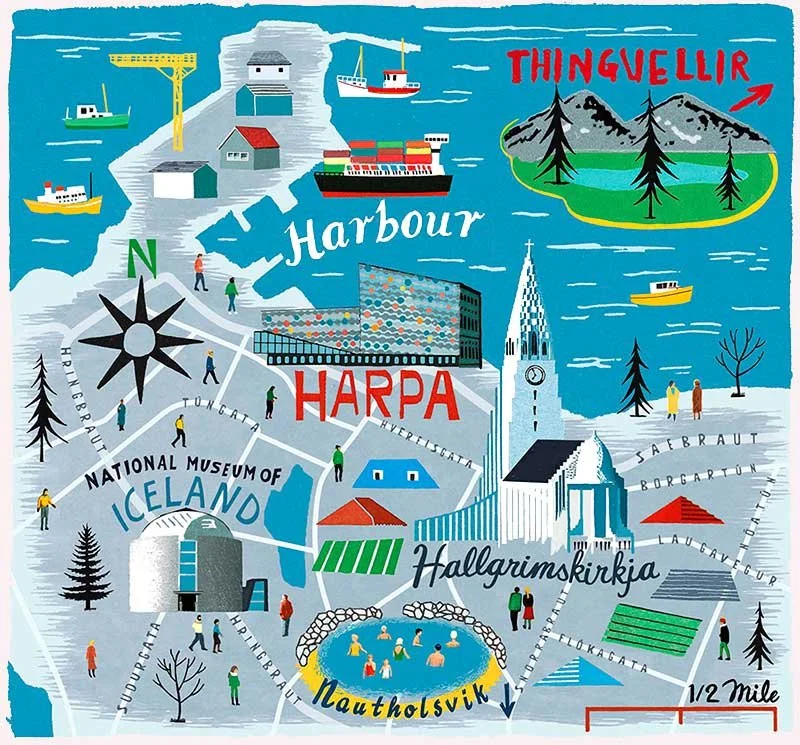
Reykjavík, balancing the built and natural environments. Flat digital layers combine with hand-made elements to give textural depth.

Drawing out detail with energy
I packed in lots of architectural detail on Hallgrímskirkja, keeping it bold and lively so the cathedral feels big (especially beside little red rooftops) but full of personality.
Peeling Back the Layers of the City
The challenge was to reveal something deeper for the magazine’s adventurous readers; to peel back the familiar image of the place and offer a fresh perspective, without losing what makes it iconic. Frequently, the focus was on trendy or up-and-coming neighbourhoods, so the homework felt less like research, and more like tapping into the latest… je ne sais quoi! To portray these places, I montaged imagery, texture and urban hand lettering to craft an impression, rather than drawing a specific landmark. Different layers turning each map into an aspirational story, waiting to be explored.

Layered textures, colour infused with warmth, and research-led lettering reflect the richness and density of Kuala Lumpur’s cultural landscape.

Pattern, Patina, and Place
I used colour, texture, and pattern to capture the layered history and visual richness of the Sultan Abdul Samad Building—giving this key spot in Merdeka Square a distinct feel that sits naturally within the map’s romantic, eclectic atmosphere.
Hand-Lettering: The Local Vernacular
Embracing the 'outsider' role, I approach distant places with fresh eyes. As contradictory as it sounds, I feel that distance helps bring me closer to a place's essence. The outsider’s gaze is a kind of superpower to an illustrator - a fresh vantage point that helps me spot the quirks and cultural nuances that stand out precisely because they're unfamiliar.

Rio’s vastness streamlined through layered bold shapes and colour contrasts - part of the National Geographic Traveller Magazine City Map Illustrations series.

Zooming In on the Fun Bits
You might miss them at first glance, but Copacabana is dotted with tiny sunbathers! One of those hidden details I like to tuck in for anyone who looks a little closer.
In this way, I love to draw inspiration from the typography spotted in architecture, local storefronts and signage, when I’m hand lettering. It feels like expressing the words and names in a sympathetic vernacular, letterforms mixing like voices. These influences all contributed to city maps that don’t just guide you from A to B, but that shares the secret lowdown on alleyway bars and the tastiest street food!
A Palette of Local Inspiration
From shades of flora, light, and architectural tones, a spectrum of colours would jump out as I researched. I then carefully curate a palette of interacting hues that reflected the unique character of the environment.
I’m really proud of my National Geographic Traveller magazine city map illustrations, as an examples how exciting and memorable visuals can foster a connection with readers. Each city's distinct history, and character were embodied in my illustrations creating a showcase of cultural diversity.
Let's Create Together
If you're interested in traveller city map illustrations, I'd love to hear from you. To explore further, take a look at my map illustration service page Let's collaborate to bring your vision to life. Together, we can create visuals that guide, inspire, and leave a lasting impression.