
USA Small-Town Maps with Retro Lettering

Tuscumbia, USA - warm yellows, blues, and oranges highlight Helen Keller’s birthplace with textured drawings and retro lettering
When I was approached to illustrate this series, the client’s goal was to create a visual journey- an invitation to explore the charm and quieter stories of places often overlooked.
Each map aimed to capture the character of its location at a glance, using retro lettering and hand-drawn details to evoke a warm, old-fashioned feel.
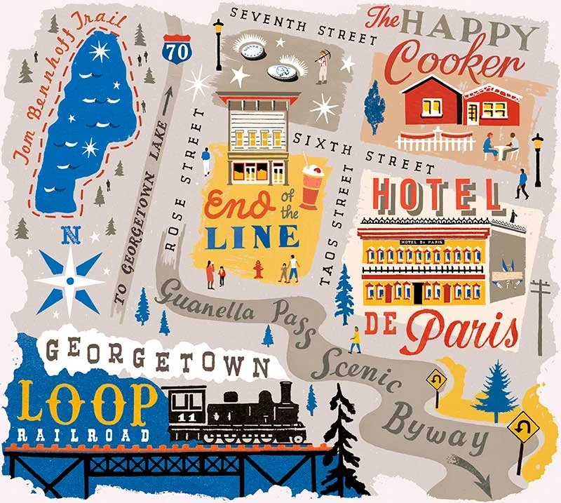
Georgetown, USA - cool tones and bright red accents frame a steam train crossing the Loop Railroad, from the USA small-town maps with retro lettering series.
Bringing It All Together
The illustrations acted as visual centrepieces, tying together the writing and photography across each issue. They brought a consistent character, helping reinforce the magazine’s voice and make the feature feel more cohesive.
Capturing the Essence of Hidden Gems
I love working on maps and travel features because illustration lets me do something photography can’t: shape a story through careful observation and interpretation. Instead of documenting what’s already there, I can pick out the small, characterful details: the accents, textures, and pace of life - those little Idiosyncrasies that give a place its real personality.

Small Town map of Leiper’s Fork, USA - warm purples and oranges depict rural life, diners, riverside scenes, and galleries in textured illustration.
As I delved into the research, I enjoyed picking out the quirks that (to me as an outsider) felt unmistakably American. With no world-famous landmarks to lean on, it was the smaller details- like retro lettering on old signs, that gave the truest sense of place.
Seasonal Colour Palettes
To bring these illustrated small-town maps to life, I thoughtfully selected a colour palette that reflected each location's unique visual characteristics. I chose shades that mirrored the natural landscape and the season featured in the issue, while also considering the architecture, shop signage, traditional crafts... Often, patterns and palettes would reveal themselves naturally.
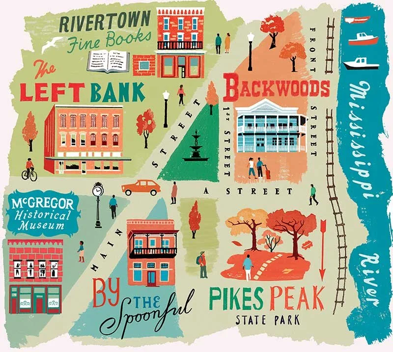
USA small-town McGregor, Iowa - autumnal travel illustration with retro palette shows old-style buildings, bookstores, cafés, and trees with nostalgic lettering.
Creating Depth with Digital Collage
The digital collage technique enabled me to seamlessly pull elements together, creating a layered, textured effect that added depth to each map. I chose retro lettering styles that reflected each town's distinct history, culture, and character. This blend of colour, texture, and lettering ensured that each map was both a portrait of a place and a visual guide, helping readers navigate the text in the feature.
Let’s Collaborate
If you're interested in maps with retro lettering, get in touch! Dive into my portfolio to see how vintage textures and vibrant palettes come to life. Or if you’re interested to see some of the different styles of map I’ve been commissioned to create, take a look at my dedicated page here. Let's create something memorable together!